Heading Styles
Content headings allow readers to make sense of the information presented. They help break material down into logical chunks of information. When headings are used correctly then both a sighted and non-sighted reader can easily navigate your content. Unfortunately, it is very easy to incorrectly add headings to a document which do not improve accessibility.
Download and look at the two documents below both will seem to have headings but only one is accessible.
Adding Headings
Headings should be sequential and nested. Headings are numbered from 1 (highest) to 6 (lowest). Typically only the first three to four heading levels are used.
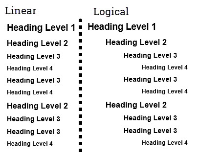
A lower level heading should represent a sub-heading under a higher level heading and that no heading levels should be skipped as you progress downwards. Visually headings are styled to that the highest level (Heading 1) has the most visual prominence and each successively lower heading has a bit less prominence. The image below shows the simple progression of headings on left hand side of image and the logical structure of headings on right hand side.
Heading Styles in Text editors
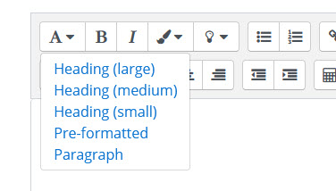
Most modern text editing environments have a method for adding structured headings. There are two common styles in which headings styles are displayed.
- Heading number listing as in Word.

- Size listing as in Moodle.
Both types work the same way as you can either select heading style before adding content OR you can add content and then select heading style. Each method will get the same results.
Other benefits of Headings
- Allow all users (including yourself!) to easily see the structure of the document.
- Allow you to easily generate a Table of Contents
- Allow you to generate a PDF that has same level of accessibility.